 we are
 we are
Over the past few years, website design has gone through various trends. One of the trends that has staying power is minimalism. This may be simply because it’s a timeless concept that has been popular in various mediums throughout the ages. So why not in web design?
One of the best features about minimalism is that it also enhances the user experience, besides looking clean and nice. A complaint of many users has been that some websites are just too busy and complicated to navigate. There’s too much stuff going on that makes the user experience less than what it should or could be.
The old saying, “less is more” still rings true. Consider a minimal web design for your website. Here are some more reasons why you should consider minimalism.
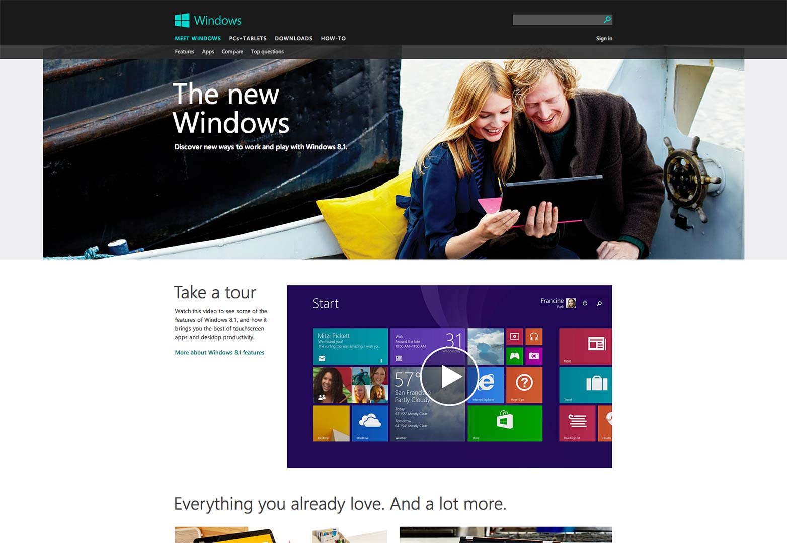
Flat design is notably characterized by an absence of drop shadows, 3D effects and gradients. It also uses vibrant colors to draw the eye of the user.
Microsoft is a great example of a company that uses a flat design for its website. On the site you see no evidence of any shadows or gradients– you only see everything in 2D. The page layout is very clean and without clutter; icons and buttons are vibrant and flat as can be; and the images of Windows 8 start screens are a study in flat design.
White space isn’t just a smart design element that guides the eye to go where you want it to go on a webpage, but it’s also a standard-bearer for minimalism. More and more websites are going to this design technique as they realize how beneficial it is.
Don’t think that just because your website has white space it represents emptiness. It’s actually a very smart design element that assists in guiding the eyes of the user.
One of the biggest rules in increasing conversions on any eCommerce or B2B site is to remove the number of choices you give to your users, buyers, or visitors. When you take away as many choices as possible, you are not letting your visitors become distracted by anything that can impede then from completing the page’s goal, which is to convert. Thus, less choice is another stunning example of minimalism in web design.
The navigation menu can be overlooked when discussing minimalism website design. However, simplified navigation can be just as important. A navigation menu that is not complex and one that quietly blends into the background is key to making a site minimalist on a functional level.
Minimalism is a great element to consider for your website design. Although it may seem blank, it will enhance user experience and be easy to use and visually digest for all users. Minimalism creates a clean and well-organized design that makes things easier for your site visitors.
Minimalism is the latest trend in website design, so let’s chat to see how it fits into your future website.


We believe your technology should adapt to fit your business process, not your business process adapt to fit technology.
Let's Get Started!Email: info@fivetechnology.com
Office Address:: Suite 100
300 Railroad Avenue
Delano, MN 55328
Mail: P. O. Box 876
Delano, MN 55328


