 we are
 we are
As we enter the halfway point of the year, we’d like to take some time to touch on the trends that we have noticed in website design thus far. If you haven’t enhanced your website yet this year, these trends may inspire you to do so, or at least give you some great things to consider when it is time for a website redesign.
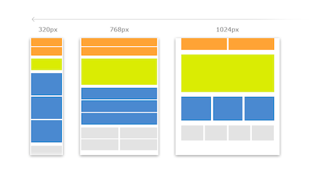
This has been a trend for over a year now, but it is still gaining in popularity. As more and more people explore the web via a mobile device like a tablet or smartphone, responsive web design becomes less of a trend and more of a standard piece in building and designing a website. A responsive web design allows your website to adapt to any device’s screen, which will provide your users with a consistent and fantastic user experience. Having a website that looks great on any device is a must.
Lately, websites have used a lot of flat design elements. What is flat design? Think Apple’s new iOS 7 and Windows 8. This type of flat user-interface has gained in popularity due to the minimalist and clean look that it can provide. Also, a flat design is typically easier and more straightforward to use. So, a flat design combined with a responsive web design can enhance your user experience a lot.
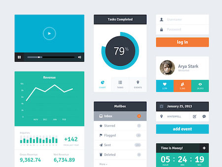
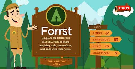
Today, people of all ages are living fast-paced lives and they have no time for browsing a website that is cluttered and difficult to navigate. Users are looking for websites that are minimalist and clean in design and layout, as well as websites that can be used instinctively–navigating the site should be second nature. Websites should follow the KISS philosophy–Keep It Simple Stupid. Simple design, simple layout, simple navigation, great user experience.
One way to provide simple navigation for your website is by eliminating navigation. Obviously, this won’t work for sites with a ton of content, but if you have a minimal amount of content a one-page design might be the way to go. These websites make use of overlays, light boxes, and tiles, that can be simply repositioned and expanded for a variety of content on their websites. A road map with one route on it is easier to follow than a map with 20 routes on it. Make sure your website provides an easy route for users to find the content they are looking for.
In the world of 3D movies and even 3D televisions, why not have 3D websites. For people who want to implement a website that enters the third dimension, building a parallax effect is a great start. Parallax design provides a scrolling technique that helps in creating the illusion of a depth of field for the user. It combines a variety of effects on movement, depth, and 3D illusions bring another dimension to your website–No weird glasses needed!
Infographics have taken over the web over the last year or so. Infographics alone are a great way to provide vital information in a creative format for your readers, but SEO wise they are not the best as none of the text is indexed by search engines. So, why not make these graphics interactive. Make your great infographics even better by adding functionality and making them interactive to still provide that great information in a creative way, but also reap the benefits of SEO. Expand the use of your graphic by transforming your website into an infographic. With the use of touch screens gaining in popularity, this shouldn’t be too difficult even with responsive web designs.
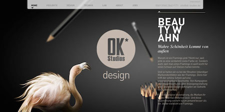
The web has become an image centric medium, which means your website needs to be very visually appealing in order to be successful. Images and illustrations in a website are necessity to stimulating engagement. There are several ways to make your images more intriguing too. Experiment with adding overlays and different effects to make them even more appealing and engaging.
A responsive web design is not enough, you need to make sure that your responsive web design is mobile ready–in most cases your website design company should make responsive and mobile ready one-in-the-same, but keep in mind that there is a slight difference. You may have a website design that looks great on any screen size, but is not optimized well for mobile devices (i.e. length of content, image sizing, load time, etc.)
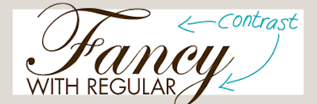
Boring web-based fonts are no longer your only option for your website. Your typography’s size and styling should incorporate some variety. You can even leverage a responsive typography that will make your website more interactive. However, you should make sure not to overdo the mixing and matching of typography. You do not want your site to look like it uses every font on the web.
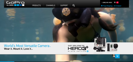
More and more websites are beginning to implement videos in place of images and text to convey a specific message to the website visitors. Many websites have even extended the use of videos on their websites by using the video as their background in the hero area of the homepage. With today’s technology, videos and images can be incorporated simultaneously into slideshows very easily.
We believe your technology should adapt to fit your business process, not your business process adapt to fit technology.
Let's Get Started!Email: info@fivetechnology.com
Office Address:: Suite 100
300 Railroad Avenue
Delano, MN 55328
Mail: P. O. Box 876
Delano, MN 55328


