 we are
 we are

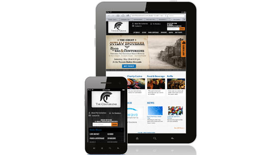
There’s no denying that mobile is the way your customer will connect with your business from this point moving forward. But since it’s still an upcoming tactic, web designs for smartphones and tablets are struggling to make their pages appealing and user friendly.
60SecondMarketer.com, a blogging website for all things marketing and website design, provides four basics you should keep in mind to enhance your mobile website design:
It’s always a good idea to keep things simple when it comes to mobile website design. To increase functionality, a mobile website design should only include the most important content and in the most simplified way. Some easy steps you can take to prevent over-designing your mobile website include
Like simplicity, usability is another top priority when it comes to optimizing your mobile site. Visitors need space to select links and scroll through your pages. The more white space you provide them, the easier it is for them to make their way around.
The same goes for the size of links — the bigger they are, the easier it is for the users to tap them. In addition, it’s a good idea to ensure that all the information you’ve included is categorized and sorted logically, making everything easy to find. Last but not least, verify that every button, image, and menu option is clearly legible and working properly.
One of the main reasons users abandon both mobile and desktop websites is due to slow loading time. If your mobile website has heavy graphics, like videos or large images, loading time can significantly increase. It’s also important to remember that while the features of your website may appear fine on the smartphone, they may not render over properly to a different smartphone. As a result, it’s a good idea to test your site across multiple platforms.
It’s important to know what kind of information users who visit your mobile website will be looking for (such as location or business hours) and to plan accordingly. Google Analytics can help you get that data. Their analytics will show you where traffic is coming from, which sections of your site are most popular amongst users, and other information that’ll help you design an effective site for mobile. Using that data to optimize your mobile website design is a constant process that shouldn’t be overlooked.
More and more people are using their smartphones and tablets to visit websites, so make sure that your mobile website is designed to meet the need and wants of your visitors. By avoiding a complicated, dysfunctional and slow website design, users will stay longer and can easily browse around the site.
If your company is wanting to make your website more accessible and easier to navigate for mobile device users, we’ll help you with your mobile website design needs.
Read the full article from The 60 Second Marketer.
We believe your technology should adapt to fit your business process, not your business process adapt to fit technology.
Let's Get Started!Email: info@fivetechnology.com
Office Address:: Suite 100
300 Railroad Avenue
Delano, MN 55328
Mail: P. O. Box 876
Delano, MN 55328


